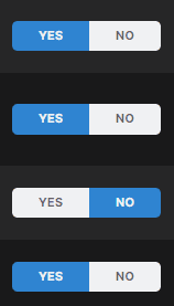
Inconsistent On/Off toggles
Опис
By traditional UI design the toggle should be shifted to the left when it's off, and to the right when it's on. For some reason the launcher doesn't comply with it. It also contradicts what we see in the game, which can be confusing sometimes.
My suggestion is to make the toggles in the Launcher according to the traditional design (NO/YES).
Current LabyMod Launcher toggles:

In-game toggles:


